Role & Timeline:
Product Designer | Duration: 6 months
Stakeholders:
Clinic operators, Development team, Managing directors, Clinic experts, Ophthalmologists, Marketing team
UX Case Study
Designing for better Precision & Control: A Smarter Interface for Retinal Capture
Redesigning an outdated medical imaging interface to improve operator confidence, reduce patient fatigue, and ensure more gradable retinal scans.
OiVi
The Eye of the System
Oivi is a medical-tech company developing a compact, AI-powered retinal (fundus) camera for early detection of diabetic retinopathy.
Designed to be used by non-specialist operators in primary care settings, the device captures high-quality retinal images in under 3 minutes.
context
A System That Needed a Revamp
Picture this: an operator sits down to scan a patient’s eyes. They squint at a clunky, outdated interface that looks like it’s straight out of Windows XP. They’re not sure if an image is clear, or if they should retake it. There’s no feedback. No guidance. Just frustration—building by the second.
Now imagine that happening hundreds of times a day. Patient queues grow. Scans take longer. Operators become overwhelmed. And worst of all, missing critical signs to capture what OiVi is trying to establish: To capture high quality retinal images.
challenges
The goal wasn’t just to make things pretty—it was about:
Giving operators clarity and confidence
Reducing errors and retakes
Guiding patients clearly through a stressful process
Aligning everything with Oivi’s new branding
goals

Operators had no feedback on whether an image was usable.
“Did I get the
right capture?”
“Failed to capture. Try again”
The system didn’t tell them how to fix mistakes.
No clear limits on retakes led to patient fatigue & frustration.
“How many times do I have to do this?”
The interface was cluttered and confusing.
“Wait, has the
image uploaded?”
Here's what I set out to fix:
By observing the operators at work gave us some insights-
insights
The solutions we came up with:
With the above insights, we could arrive at these possible ways to improvise the existing flows.
solution
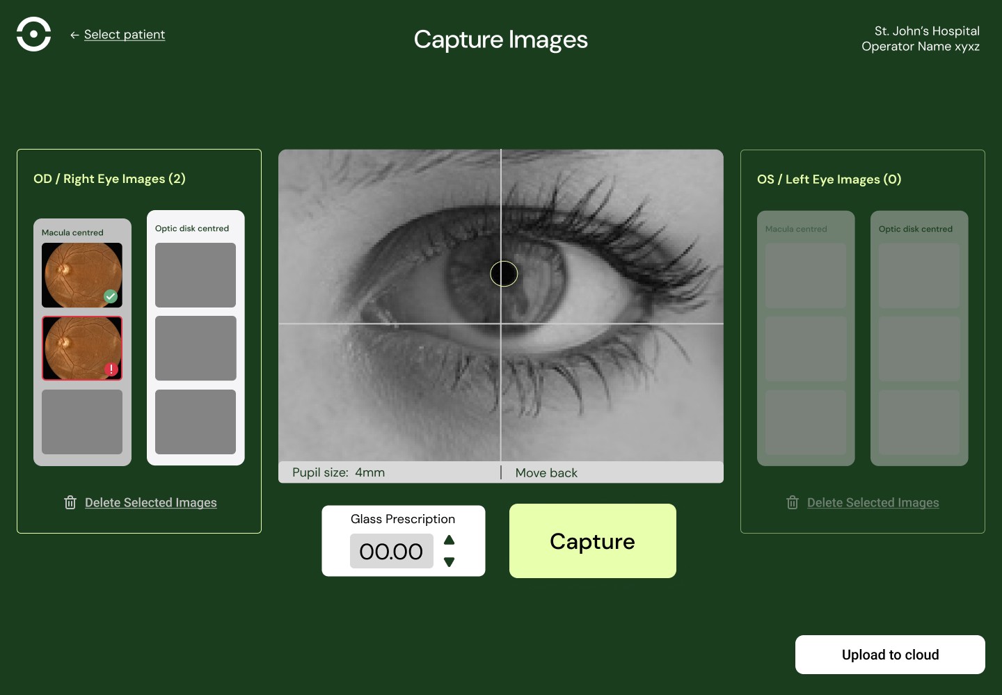
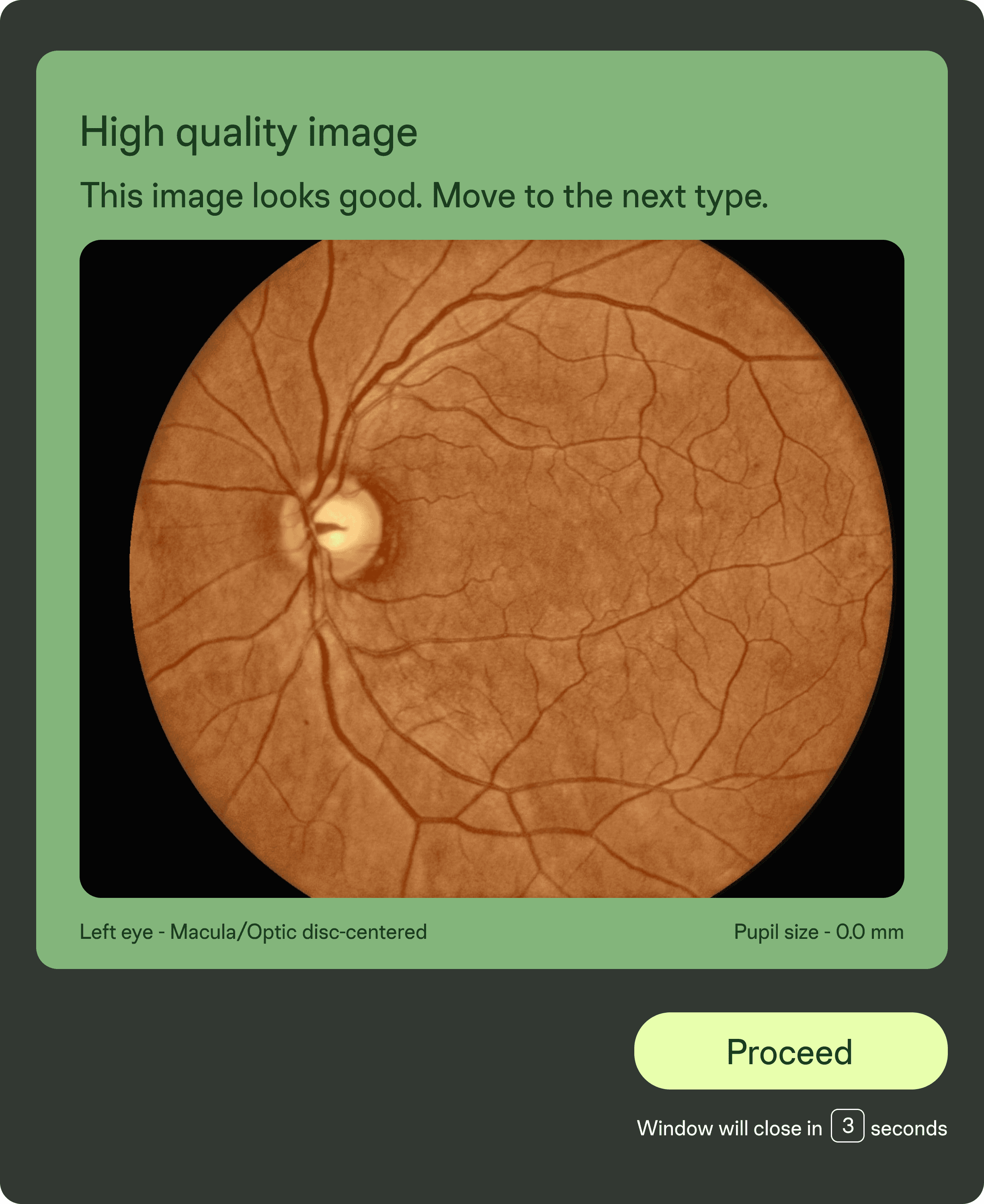
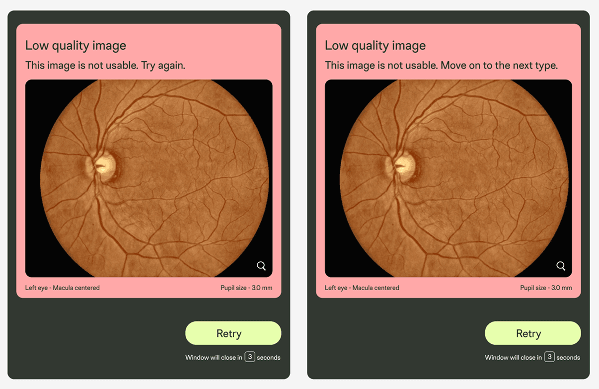
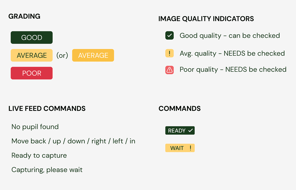
Clear Categorisation
System graded image quality (Good / Average / Poor) with visuals and tip
The impact we created:
impact
Clearer captures within the first try,
fewer retakes = saved storage and time
With structure and feedback, they knew what they were doing—and why
Reduced patient scan time by 25–30% after rollout
More gradable images
Operator Confidence
Time saved
process
Design Exploration: Trial, Error & Insight
Initial explorations
Modal design
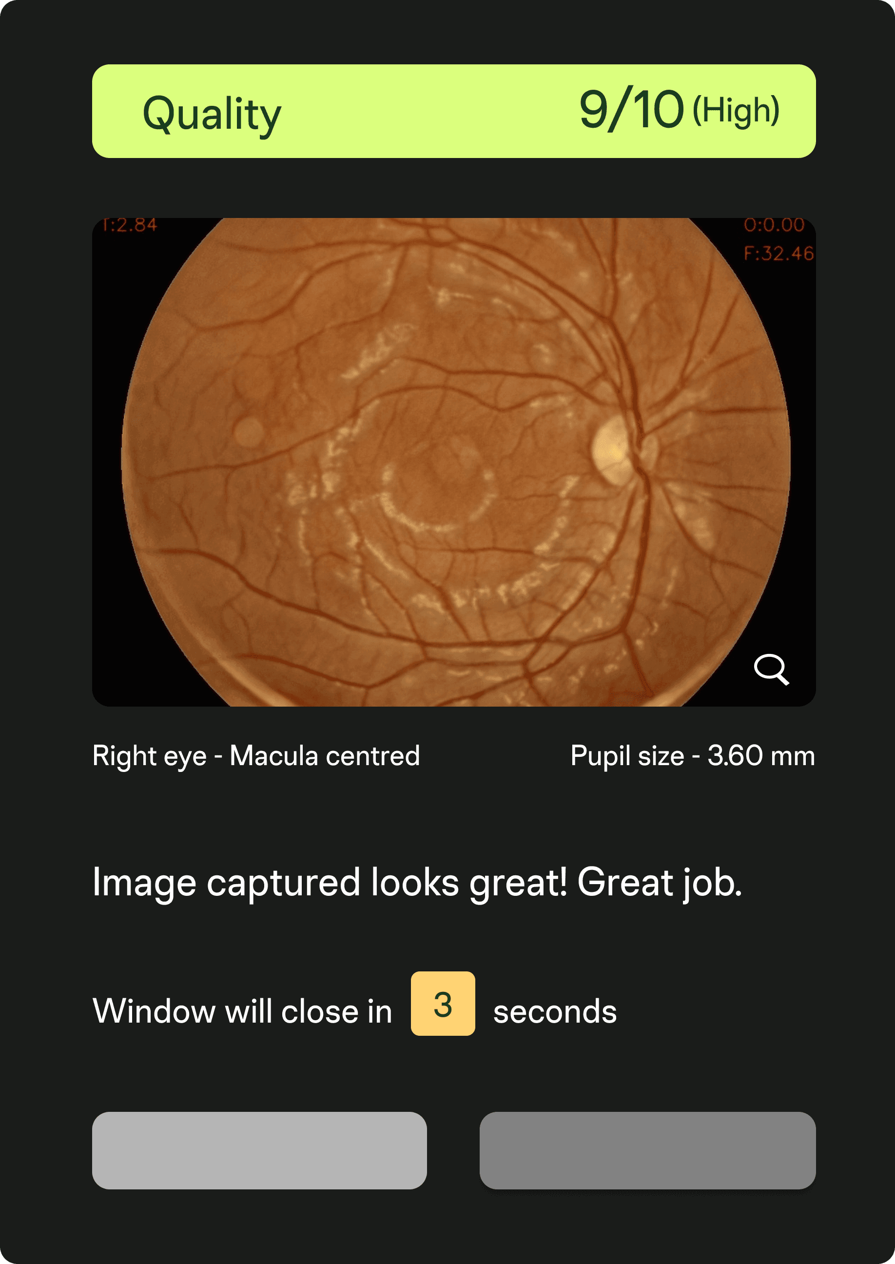
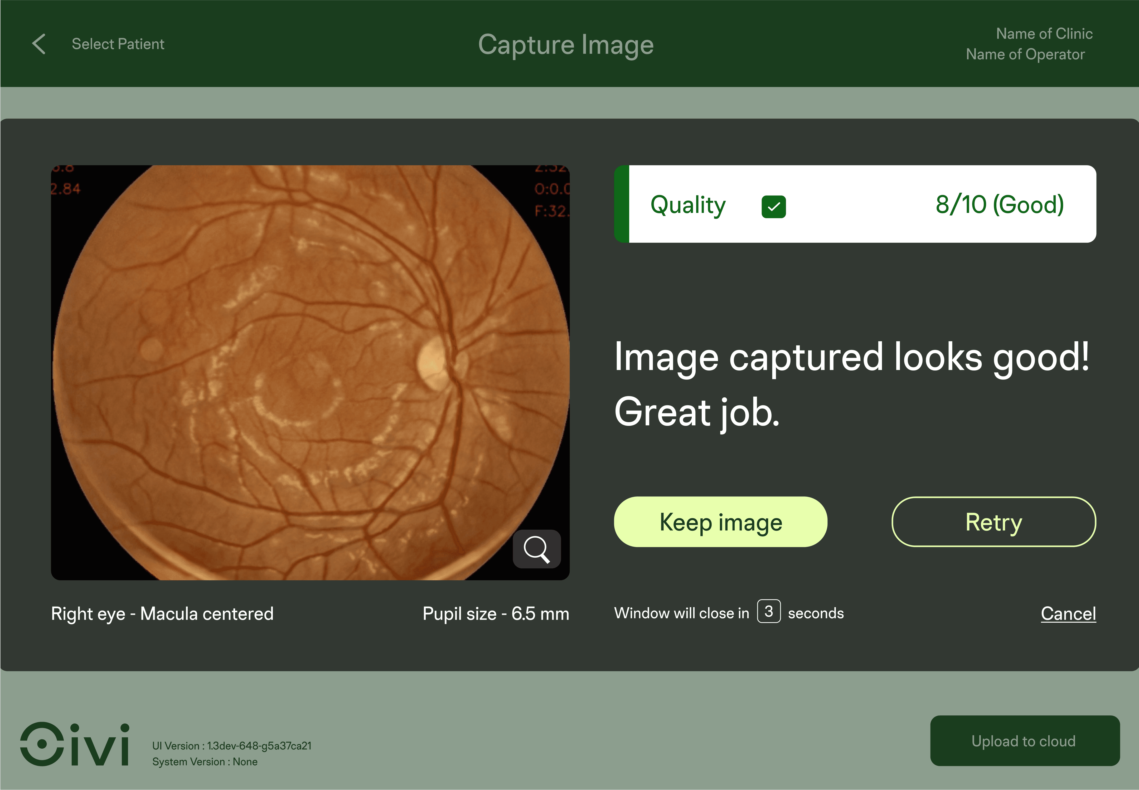
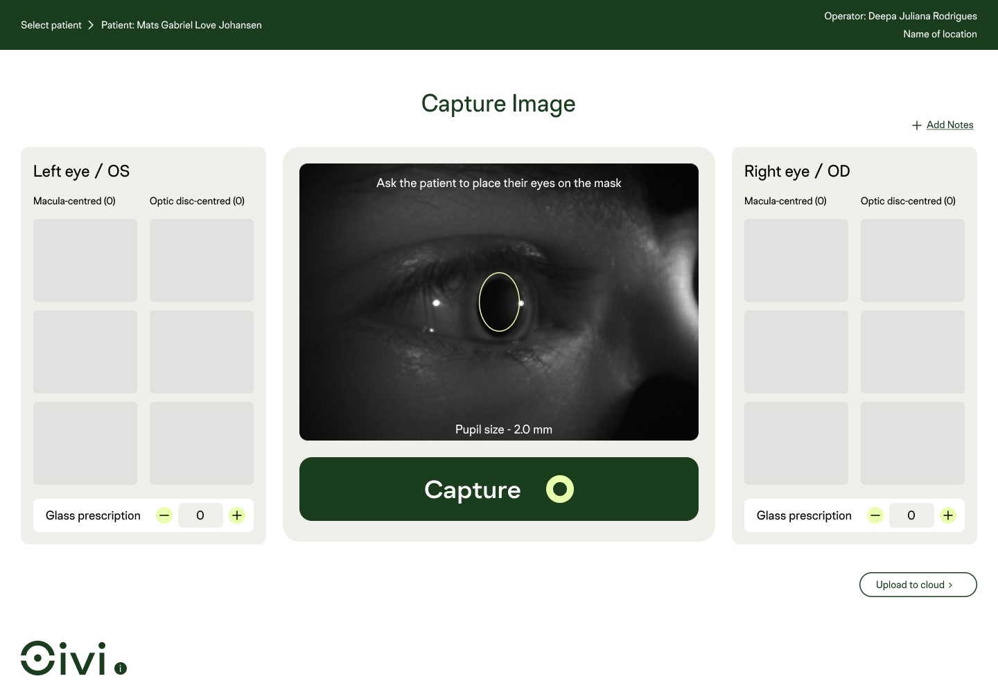
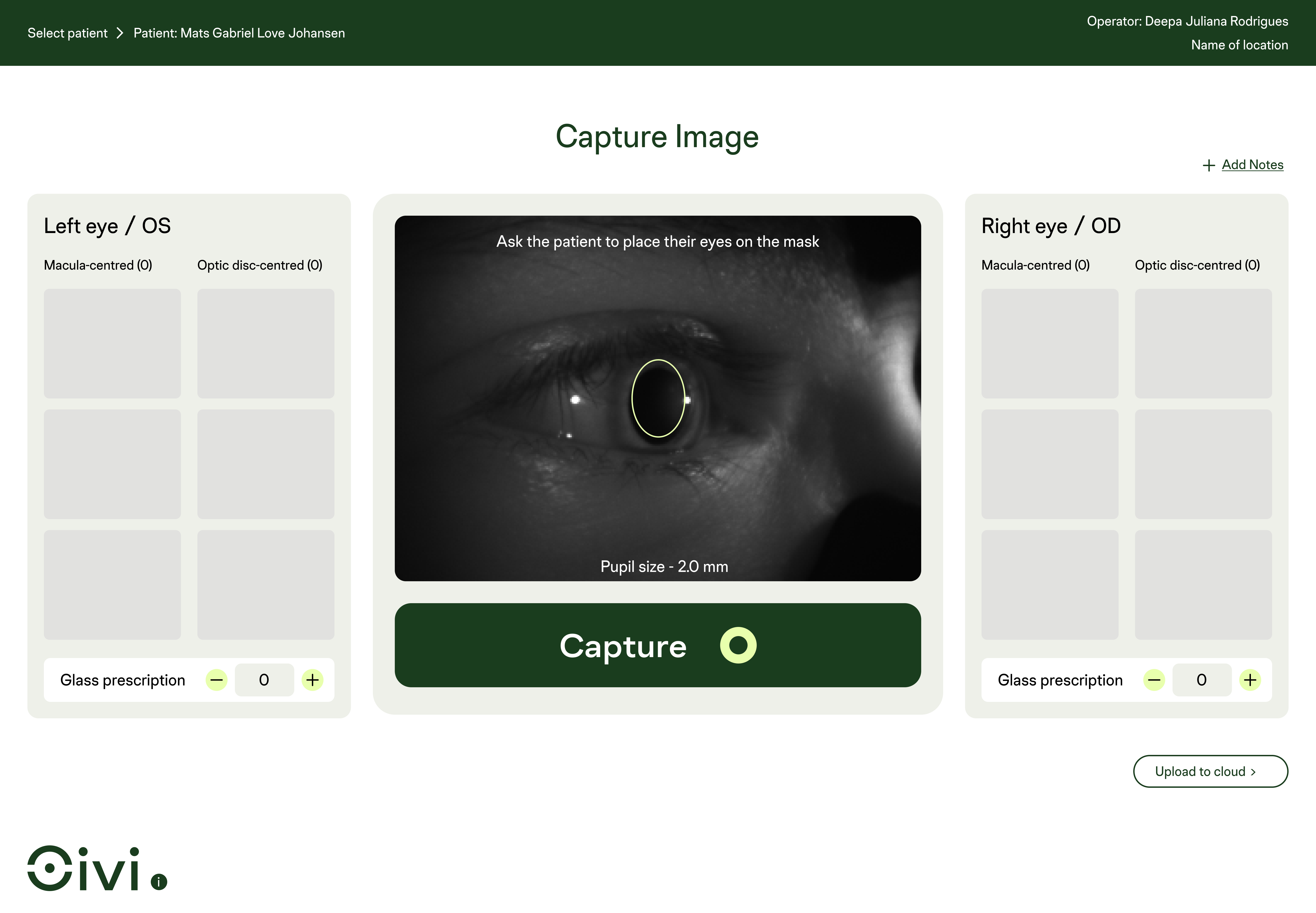
Image Assessment Screen
This solution was the result of several explorations, trials, errors, and ongoing collaboration.
Let me take you through how we made it happen.
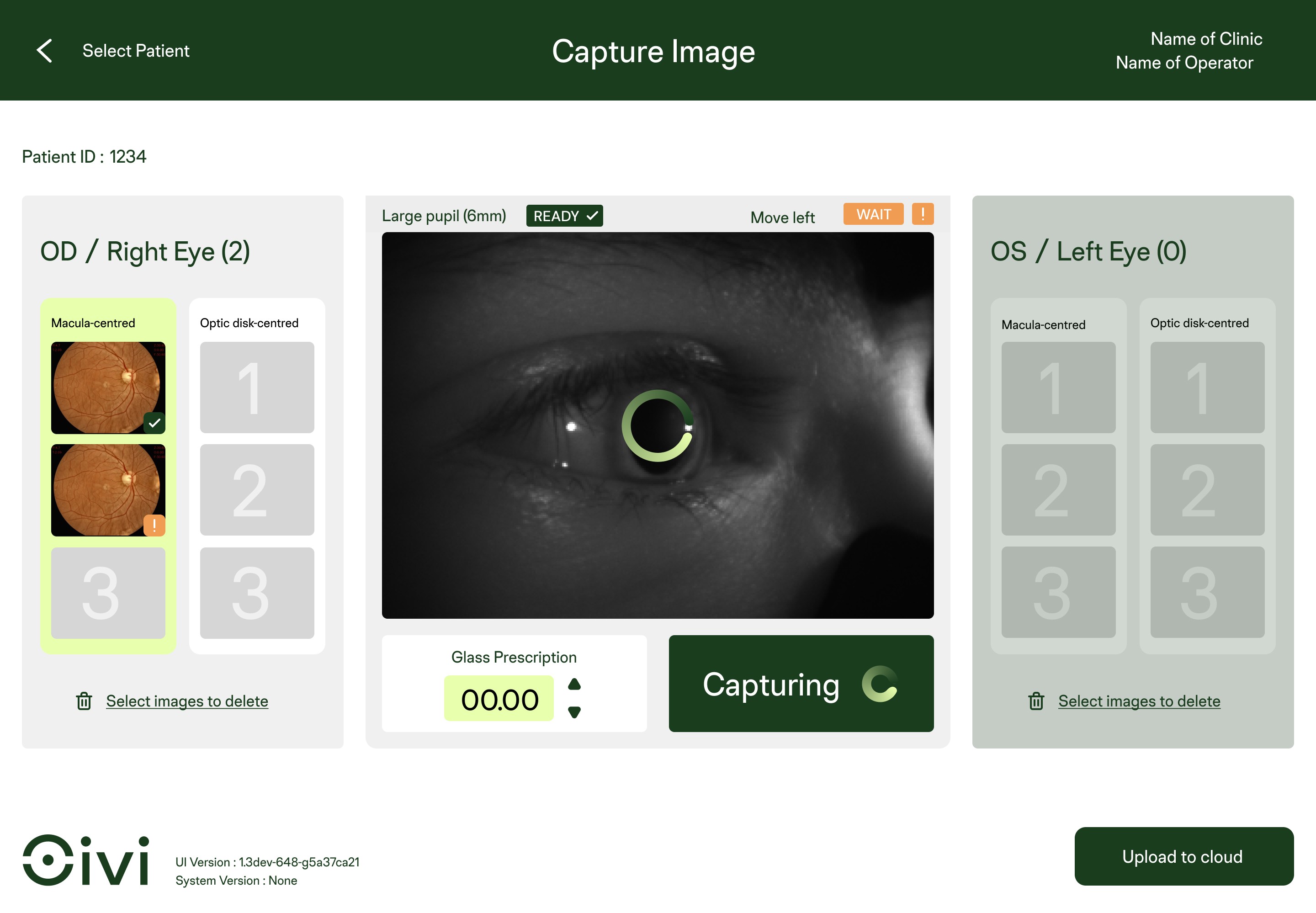
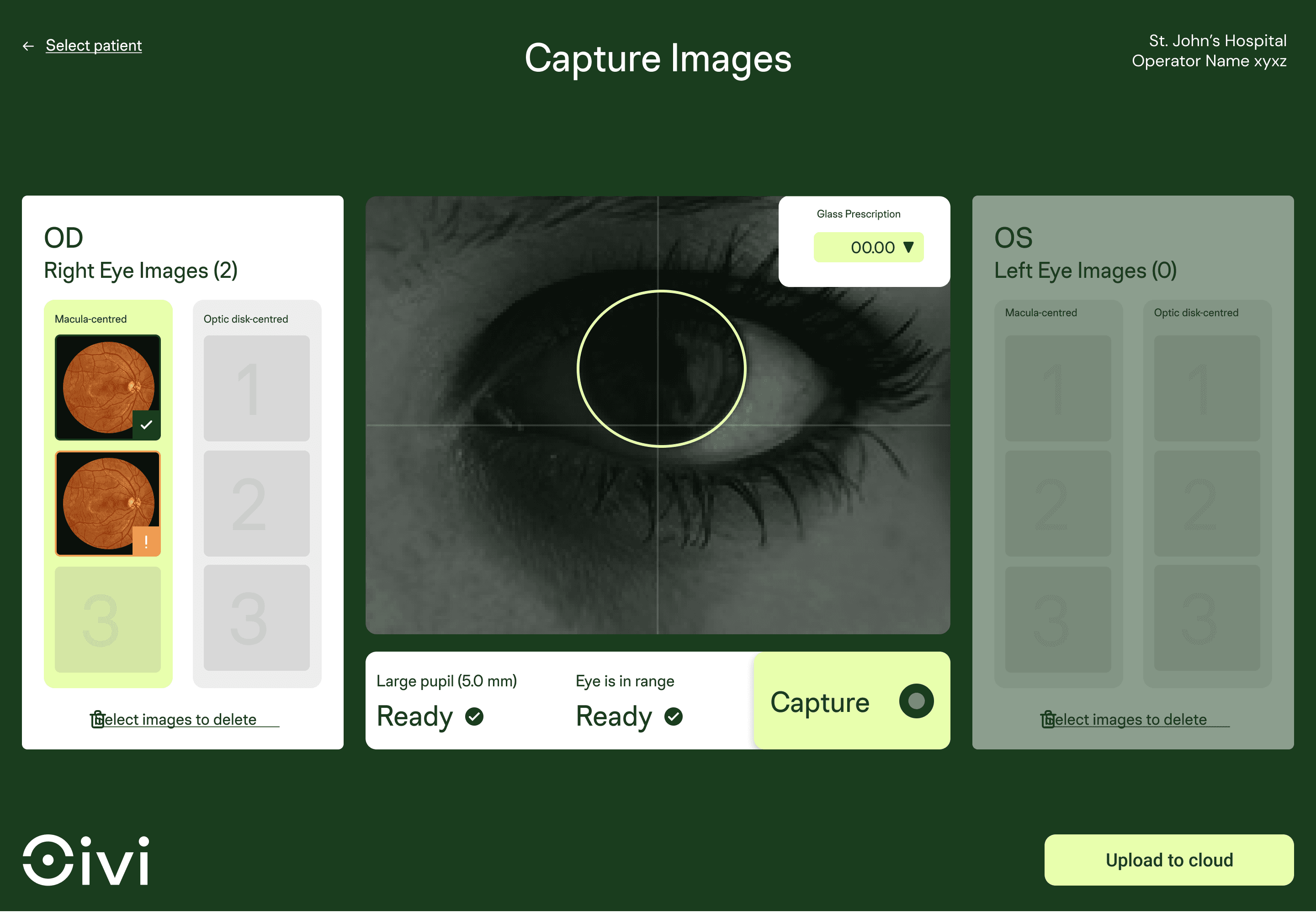
I explored multiple UI directions based on colour schemes (black, greens, white), layout positioning for key elements (capture button, prescription tally, image history), and new functional options like delete, image count, & tagging.
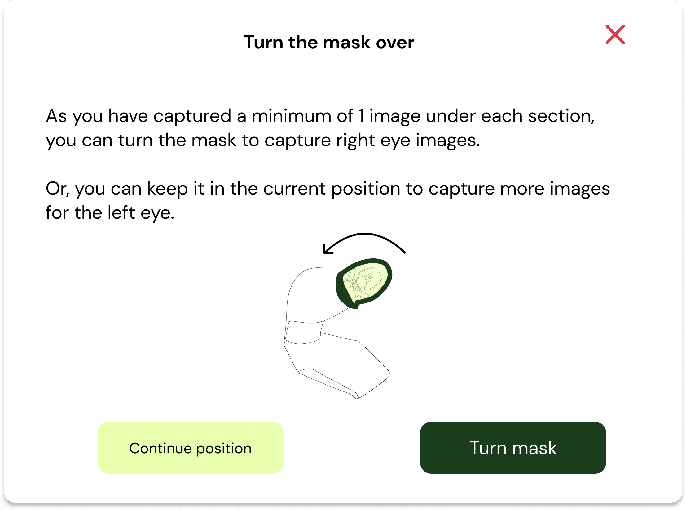
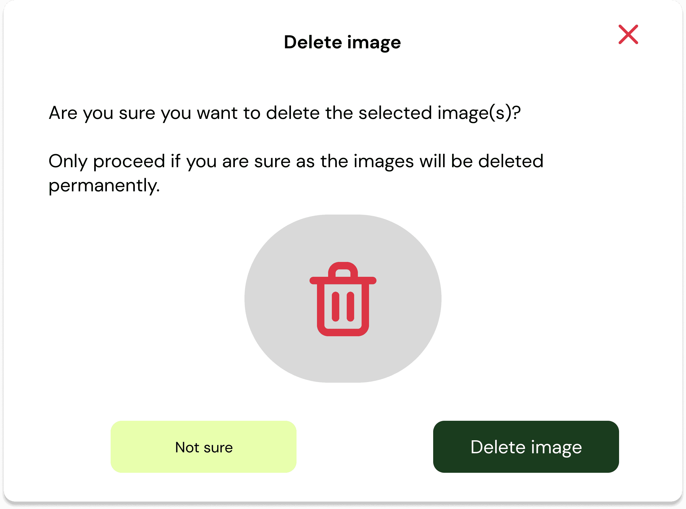
I introduced modals for clearer guidance during key actions:
Switching the eye mask position (left/right eye)
Deleting a captured image
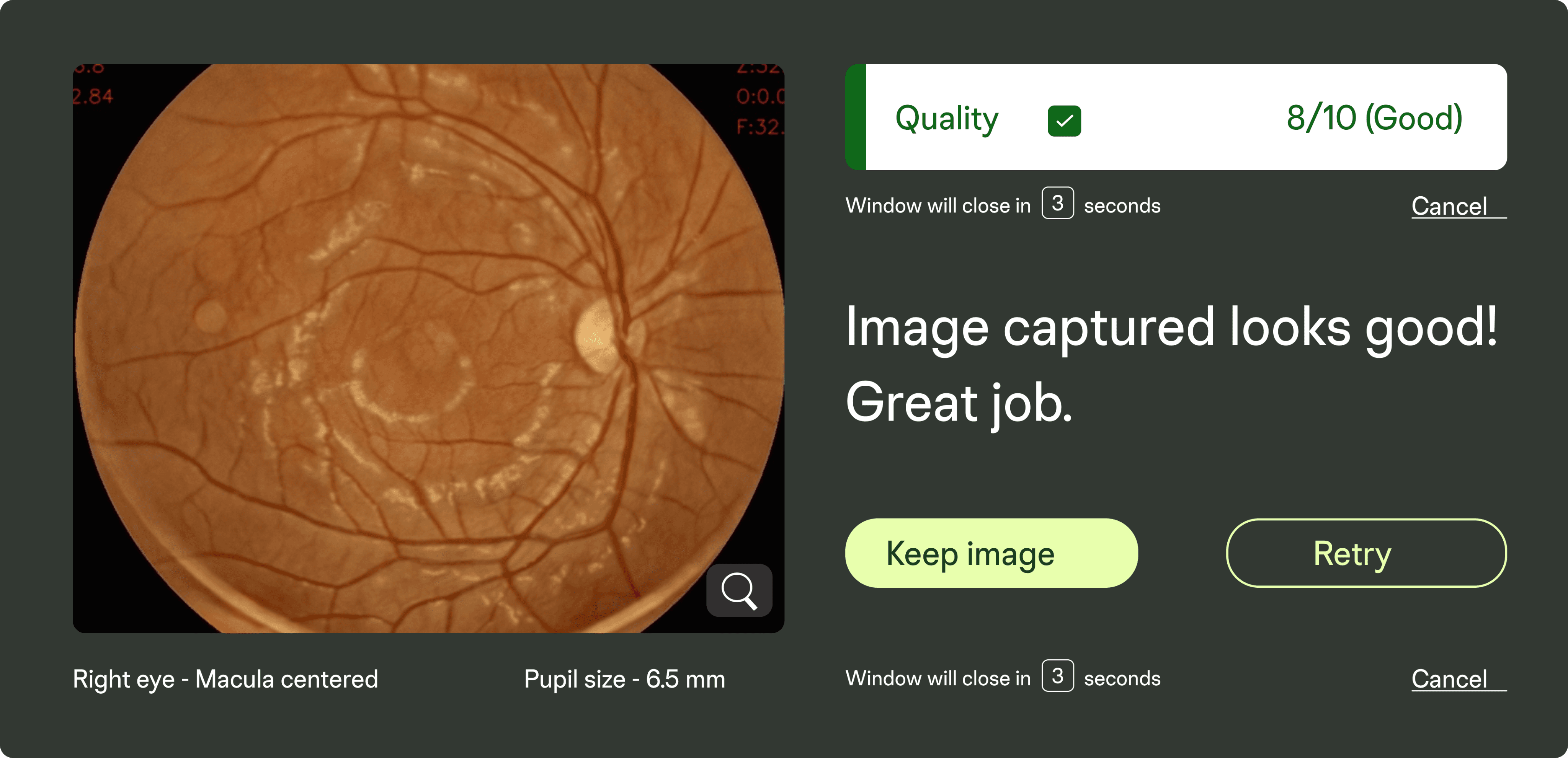
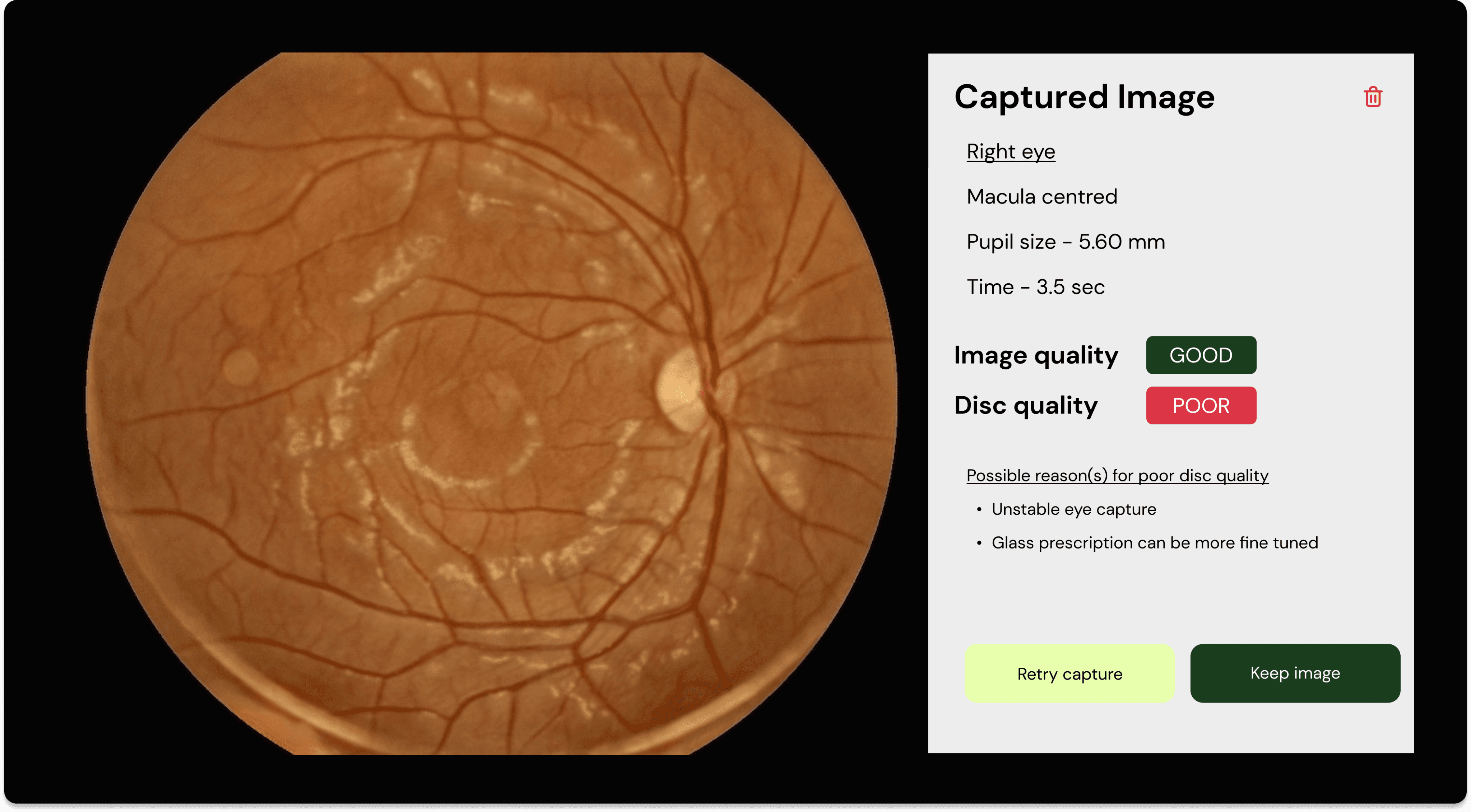
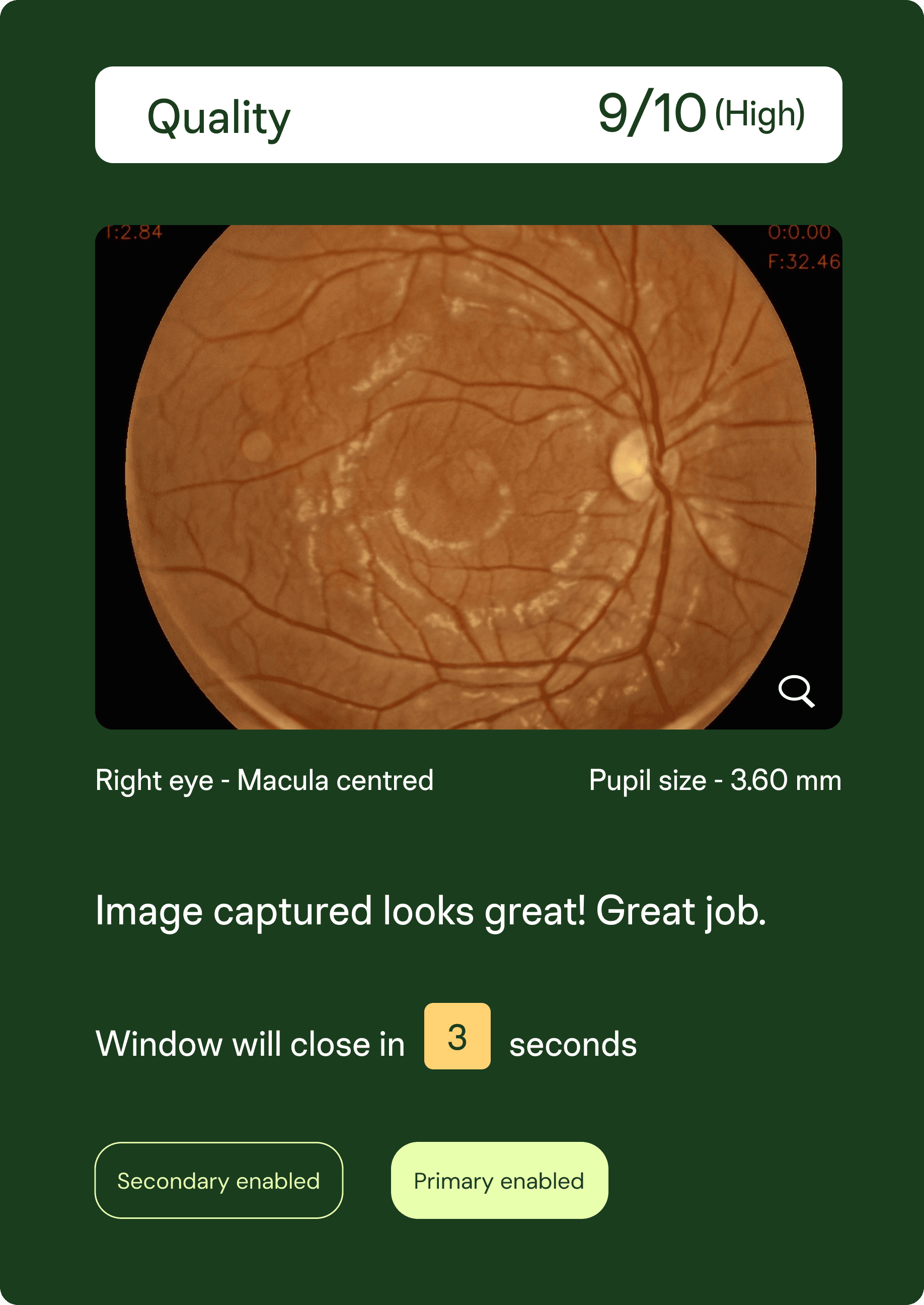
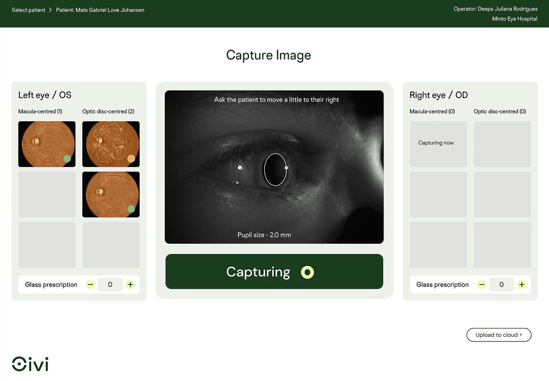
To support quality imaging, I crafted an after-capture screen:
Eye specs Left/Right, Pupil size, Cataract presence
Image type Macula/Disk-centered
Gradability Good / Average / Poor (with color indicators and score)
CTAs Cancel, Upload to Cloud
Extra: Bite-sized improvement suggestions (e.g., "Ask patient to blink less")
These modals were designed to be intuitive, timely, and empowering—
making users feel confident and in control.
These were initial drafts, that required to be tested and approved.
The idea was to get as much information out for the user to make sense of.
I mapped out two key flows to mirror field reality:
Use Cases: Designing for real world chaos
Mapping different use cases
Case I: The Ideal flow
Case II: The Non-ideal flow
A smooth, quick flow where everything works as expected.
Fewer retakes, happy patient, happy operator.
Multiple failed captures, longer process, and operator fatigue. We focused heavily on supporting this flow—ensuring the interface helped guide and not hinder.
Testing
Test 1
Goal
Method
Insights
A smooth, quick flow where everything works as expected.
Fewer retakes, happy patient, happy operator.
Evaluate the new Pupil Detection feature and its impact on post-capture usability.
Tested the existing build with clinic operators at the clinic. Observed how they navigated image capture in real time, with a focus on task clarity and layout .
Tested a partly functional build with real-time detection and basic categorisation. Used the think-aloud method to understand user interaction with alerts and image grouping.
Users felt unsure of what step came next—flow needed clearer guidance.
Spacing and button layout felt cramped, affecting ease of use.
Technical glitches in the system resulted in frustration for both operators and patients.
Some modal notifications can auto-dismiss after a few seconds to reduce clicks and avoid interrupting the operator’s flow.
The lack of visual emphasis on its container led to cognitive friction, as users struggled to distinguish it from other image-type boxes in the post-capture interface.
Insights
Method
Goal
Test 2
learnings
The take-aways working at OiVi
Having good cross functional relationships especially with the Dev team made the idea exchange process easy
Iterative design processes really does lead to excellent results
Attention to details makes a difference.
The prototype was especially useful during handoff to align functionality with experience and reduce back-and-forths during development.
prototype
Step-by-step patient imaging
Auto-classification in action
Edge-case modals and visual feedback
Post-capture review and upload options
To make design intent crystal clear across teams, I created an interactive prototype using Figma. This helped stakeholders walk through:
This helped us maintain alignment across devices and ensured that visual clarity translated accurately into code.
handoff
For each key section:
Visual Specs — Included annotated dimensions, corner radii, and hex codes for all UI containers
Typography Guidelines — Defined typeface, weight, size, and colour for all in-container text elements
Design System Referencing — Used callouts to direct devs to related sections in the component library
Precision for Edge Alignment — Included container paddings and visual spacing to maintain consistency with the layout grid
To ensure seamless implementation, I provided a detailed and visual-first handoff for each UI component.
The goal was to reduce ambiguity during execution and provide a clear documentation of all components.
outcomes
The key factors that were achieved during this design process
Operator Efficiency: Reduced time spent per scan by 25–30%
Clarity in UI: Fewer questions about next steps and improved navigation
Visual Trust: New branding made the product feel more modern and reliable
Reduction in Errors: Gradability improved through visual feedback and better image sorting
Design response
Test 3
Goal
Method
Insights
Internally validate the full flow with all key features integrated.
Ran exploratory testing across scenarios using a high-fidelity build. Focused on consistency, edge cases, and performance.
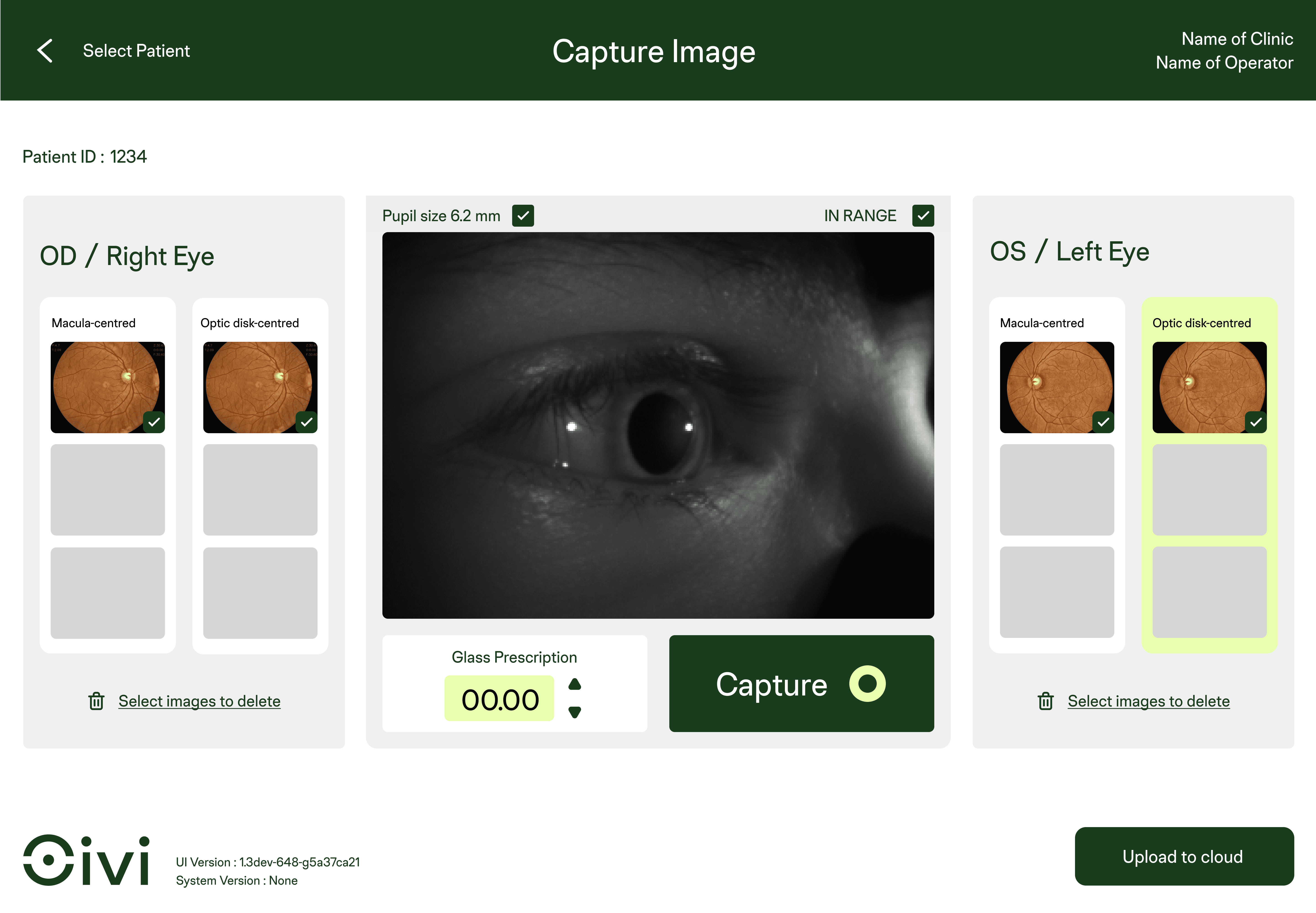
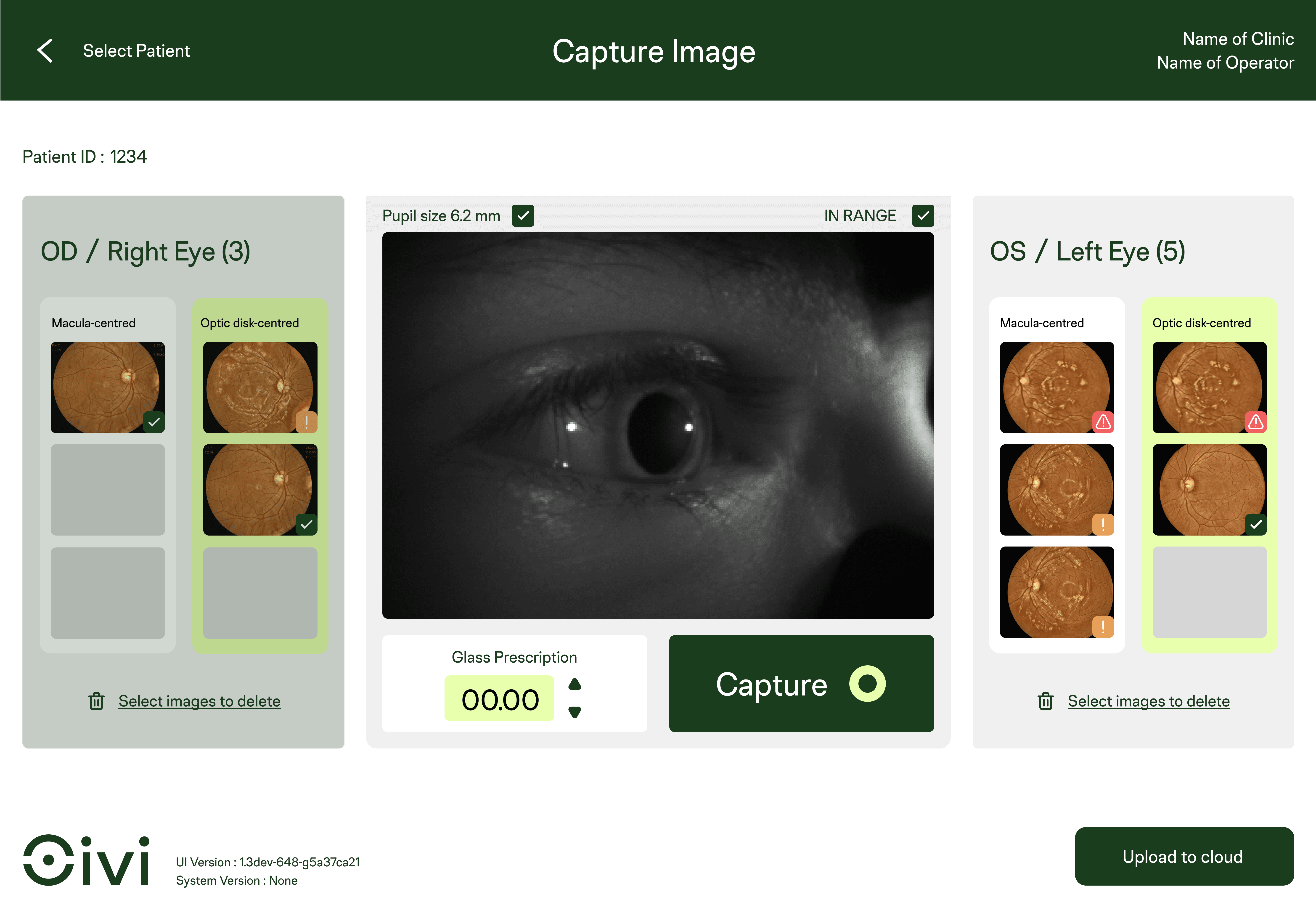
With the development team implementing automated detection of macula- and optic disc-centred images, the manual radio button selection became redundant.
To align with this improvement, we redesigned the interface by embedding categorised containers directly into the image layout—enhancing clarity, reducing interaction steps, and improving overall workflow efficiency.
No major UX issues emerged.
Main feedback was around technical feasibility and system performance, now being addressed by the dev team.
The feedback helped to loop back into iterative design refinements.
After multiple rounds of iteration and internal testing, I consolidated all visual feedback and usability insights into a clean, high-fidelity interface. The final design incorporated:
result
A modern, brand-aligned look with better spacing, colour contrast, and content hierarchy
Clear Left/Right eye segmentation with auto-classified macula and optic disc images
Streamlined capture-to-upload flow with fewer manual inputs
Non-intrusive notifications and improved system guidance
Real-time Image Feedback
Instant visual assessment to guide operator decisions
Sequential Patient Guidance
Pre-capture instructions helped reduce blinking and mispositioning
Fresh, Modern Look
Updated UI to match Oivi’s branding, with improved layout and hierarchy